Archive for October, 2020
An update on our efforts to help Americans navigate COVID-19
by Ruth Porat on Oct.27, 2020, under 3D Models, Argentina, Australia, Brazil, California, Denmark, England, Germany, Google Earth News, Google Earth Tips, Google Sky, Google maps, Hawaii, Indonesia, Ireland, Italy, Japan, Kenya, Mexico, Natural Landmarks, Netherlands, Sightseeing, Street Views, USA
The COVID-19 pandemic has brought unprecedented challenges and emphasized how important it is for each of us to do our part to help find solutions. I’m sharing an update here on how Google is contributing to keep people safe and helping to get American businesses back up and running.
Contributing to economic recovery efforts
As I’ve written earlier, to help small businesses gain easier access to badly-needed capital, we founded the $170 million Grow with Google Small Business Fund alongside $10 million in Google.org grants, with an aim to help the most underserved small businesses, particularly those owned by women and minorities. In collaboration with Opportunity Finance Network, more than $53 million dollars of loans and Google.org grants have been allocated to community partners who are focused on serving rural, women, Black, Latino and Native borrowers, which helps American communities start to get back on their feet. Tires by Papi and Bailiwick Clothing Company are two such examples.
Of course, our greatest contribution continues to be developing products to help people stay informed, adapt and get through this pandemic.
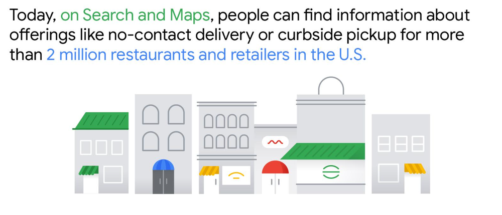
According to the Connected Commerce Council, nearly one in three small business owners report that without digital tools they would close all or parts of their business. To help small businesses, we rolled out many new, free product features earlier this year, so that they can inform their customers about things like takeout, delivery, no-contact delivery, or curbside pickup. Today, people can now find this information on Search and Maps for more than 2 million restaurants and retailers in the U.S.
We’ve used Google’s Duplex technology to make calls to businesses and confirm things like temporary closures. This has enabled us to make 3 million updates to business information globally, which have been seen by people over 20 billion times in Search and Maps.
To help people searching for jobs, we have stepped up to help in many ways. We added new relevant features in the U.S. like showing jobs that can be done remotely. Google Cloud has partnered with different states to help jobseekers: we assisted Rhode Island’s Virtual Career Center, a new platform that connects thousands of jobseekers with jobs and employment services; worked with the State of Illinois to develop a 24/7 Virtual Intelligent Agent on the IDES website; developed a chatbot, in partnership with the New Jersey Office of Innovation to provide real-time answers to the 20 most popular unemployment questions. These are just some of the examples.
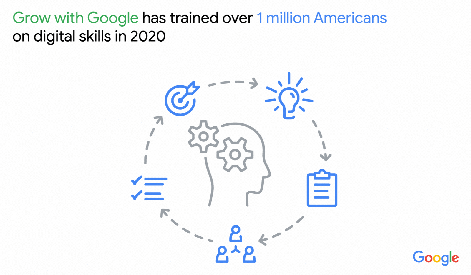
We also transformed our free Grow with Google training to virtual formats and have already trained more than 1 million Americans on digital skills this year. The Google IT Support Professional Certificate—which takes beginner learners to entry-level jobs ready in under six months—has become the most popular certificate on Coursera during COVID-19.
Providing trusted information
Questions related to the pandemic are more searched than sports or music (and even elections) in every state.
Top coronavirus related searches in the U.S. this month:
Coronavirus symptoms
Coronavirus update
Coronavirus vaccine
Across the U.S. people are searching on Google to stay informed and adapt. In 47 states, the top coronavirus-related question during the last six months has been “How many cases of coronavirus in [my state].” Search interest for “online courses” reached an all-time high in April this year, as did searches for “unemployment,”compared to search trends over the last 15 years.
During this time, we’ve also seen people seek out information to help them navigate their daily lives. For example, since the pandemic began, searches for “curbside pickup” have increased 13-fold compared to this time last year, while searches for “contact tracing” spiked 1,000 percent in April and then reached an all-time high in May.
In March, we launched Search Knowledge Panels so when people search for information related to COVID-19, they immediately see local guidance, information about symptoms, prevention and treatments. We’ve committed $250 million in Ad Grants to help government agencies provide critical information related to COVID-19. As of today we’ve served more than 100 million PSAs from local public health agencies, which have been seen by tens of millions of people across the U.S.
We also launched the Journalism Emergency Relief Fund to provide emergency funding for small and medium sized news organizations covering the pandemic. To date, we’ve distributed $9 million to U.S. newsrooms across all 50 states.
Helping people make safe choices
To help people make informed decisions about where to go, the COVID layer in Google Maps shows critical information about new cases in an area and how they’re trending. As of this month, our COVID-19 Community Mobility Reports, which are used by public health agencies and researchers around the globe, have been downloaded more than 16 million times.
In May, we partnered with Apple to launch the Exposure Notifications System (ENS) and made it available to public health authorities around the world in their fight against COVID-19. Designed specifically and carefully to protect users’ privacy while helping public health authorities and governments manage countries’ re-opening, today 13 states and U.S. territories have built apps based on this ENS technology.
In a short time, COVID-19 has changed how people live their lives. We’ll continue to update our products and roll out initiatives to help people and American businesses find trusted information, adapt and manage economic uncertainty.
Stay informed and get around safely with Google Maps
by Dane Glasgow on Oct.16, 2020, under 3D Models, Argentina, Australia, Brazil, California, Denmark, England, Germany, Google Earth News, Google Earth Tips, Google Sky, Google maps, Hawaii, Indonesia, Ireland, Italy, Japan, Kenya, Mexico, Natural Landmarks, Netherlands, Sightseeing, Street Views, USA
People turn to Google Maps for accurate, fresh information about what’s going on in the world—especially so during the pandemic. Activities like picking up something from the store, going for a walk, or grabbing a bite to eat now require a significant amount of planning and preparation. At any given time, you may be thinking: “Does the place I’m headed to have enough room for social distancing?” or “What safety precautions are being taken at my destination?”
Today, as part of our Search On event, we’re announcing new improvements to arm you with the information you need to navigate your world safely and get things done.
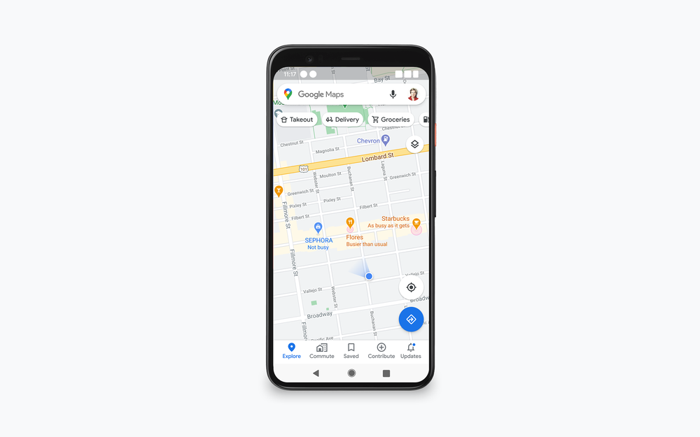
Make informed decisions with new live busyness updates
The ability to see busyness information on Google Maps has been one of our most popular features since it launched back in 2016. During the pandemic, this information has transformed into an essential tool, helping people quickly understand how busy a place is expected to be so they can make better decisions about where to go and when. In fact, as people around the world adjusted to life during the pandemic, they used popular times and live busyness information more. We saw engagement with these features rise 50 percent between March and May as more people tapped, scrolled and compared data to find the best days and times to go places.
We’ve been expanding live busyness information to millions of places around the world, and are on track to increase global coverage by five times compared to June 2020. This expansion includes more outdoor areas, like beaches and parks, and essential places, like grocery stores, gas stations, laundromats and pharmacies. Busyness information will surface in directions and right on the map—so you don’t even need to search for a specific place in order to see how busy it is. This will soon be available to Android, iOS and desktop users worldwide.
You’ll soon be able to see live busyness information without even searching for a place.
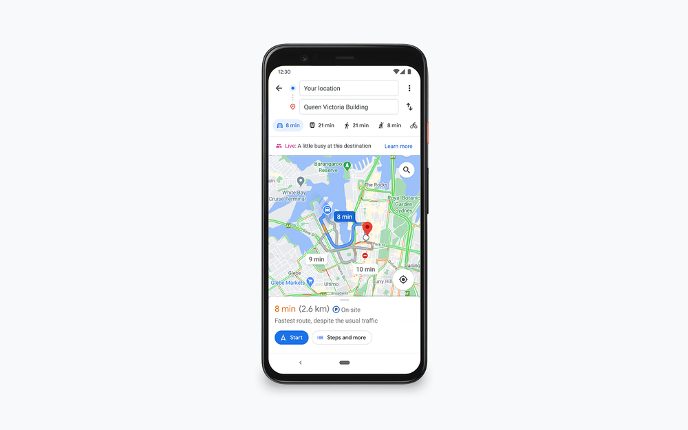
See live busyness information for your destination when getting directions
A new way to source up-to-date business information
It’s hard to know how a business’ offerings have changed during the pandemic. To help people find the freshest business information possible, we’ve been using Duplex conversational technology to call businesses and verify their information on Maps and Search. Since April 2020, this information has helped make more than 3 million updates, including updated hours of operation, delivery and pickup options, and store inventory information for in-demand products such as face masks, hand sanitizer and disinfectant. To date, these updates have been viewed more than 20 billion times.
Important health and safety information about businesses is now front and center on Maps and Search. You can quickly know what safety precautions a business is taking, such as if they require customers to wear masks and make reservations, if there’s plexiglass onsite, or if their staff takes regular temperature checks. This information comes directly from businesses, and soon Google Maps users will also be able to contribute this useful information.
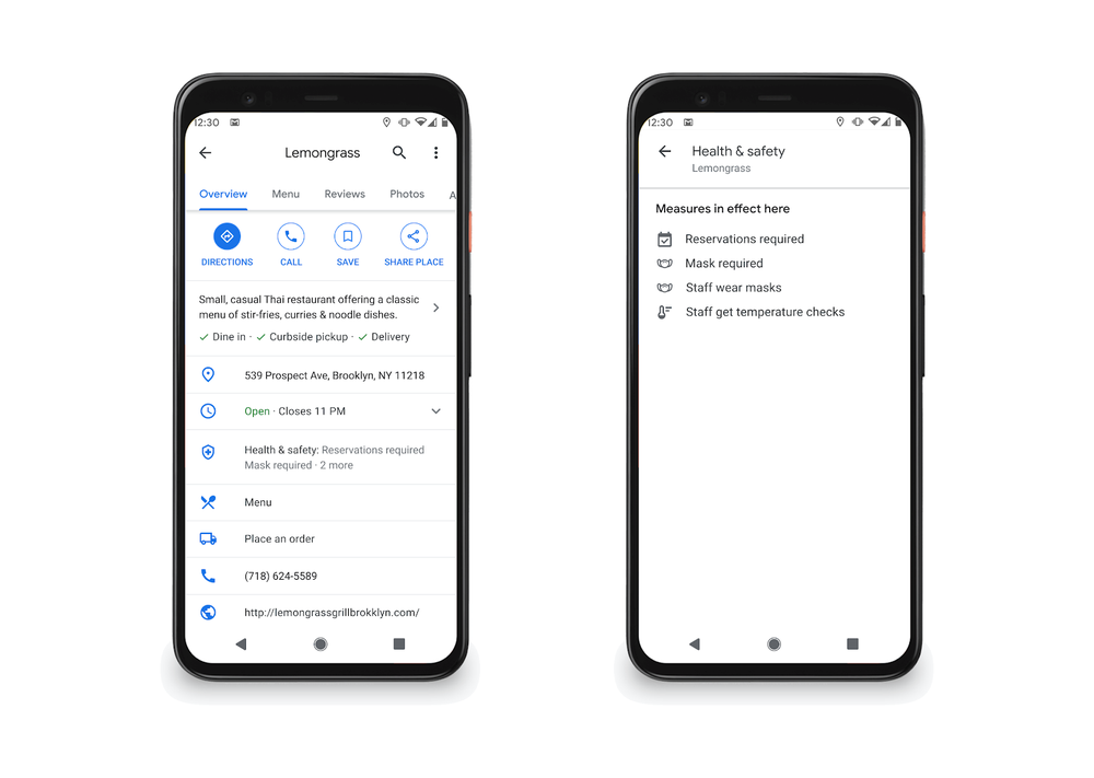
Health and safety information is now front and center in Google Maps
See helpful information right from Live View
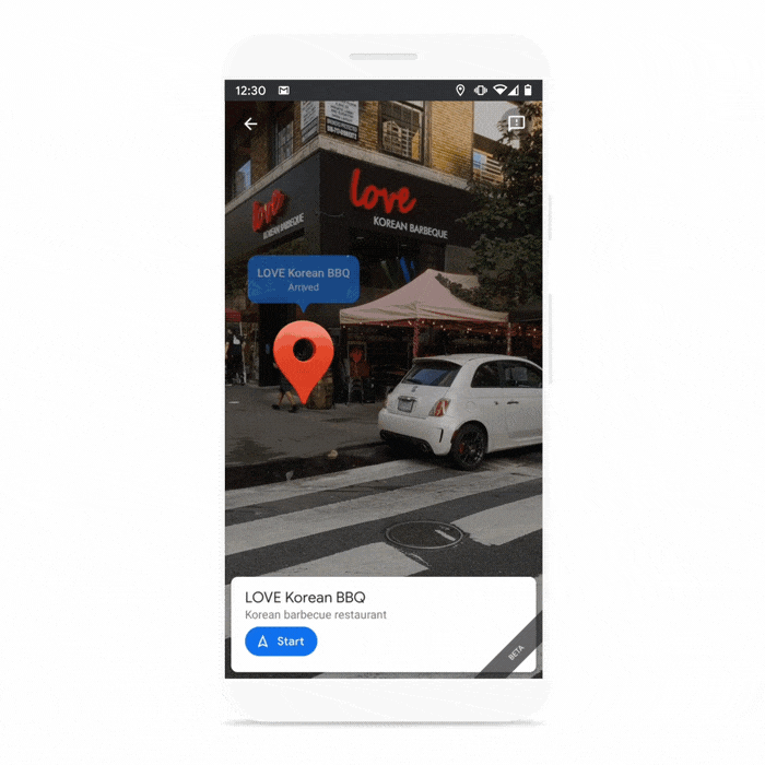
Getting around your city looks different these days. The stakes are higher due to safety concerns, and it’s important to have all the information you need before deciding to visit a place. In the coming months, people using Android and iOS devices globally will be able to use Live View, a feature that uses AR to help you find your way, to learn more about a restaurant, store or business.
Say you’re walking around a new neighborhood, and one boutique in particular captures your attention. You’ll be able to use Live View to quickly learn if it’s open, how busy it is, its star rating, and health and safety information if available,
Use Live View to quickly see helpful information about a business.
The pandemic has changed how we interact with the world. Getting around, shopping for essentials and finding things to do all require more thought and consideration, and Google Maps is here to help.
Behind the scenes: popular times and live busyness information
by Matt D'Zmura on Oct.16, 2020, under 3D Models, Argentina, Australia, Brazil, California, Denmark, England, Germany, Google Earth News, Google Earth Tips, Google Sky, Google maps, Hawaii, Indonesia, Ireland, Italy, Japan, Kenya, Mexico, Natural Landmarks, Netherlands, Sightseeing, Street Views, USA
If you’ve ever been in a rush to grab a quick bite, you may know the pain that comes along with finding out that the restaurant you chose is packed and there’s nowhere to sit. Or maybe you need to pick up just one item from the grocery store, only to find that the line is out the door—derailing your plans and causing you unnecessary stress.
These problems were top of mind when Google Maps launched popular times and live busyness information—helpful features that let you see how busy a place tends to be on a given day and time or in a specific moment. This information has become a powerful tool during the pandemic, making it easier to social distance because you know in advance how crowded a place will be. Today, we’ll take a closer look at how we calculate busyness information, while keeping your data private and secure.
Popular times: making sense of historical busyness information
To calculate busyness insights, we analyze aggregated and anonymized Location History data from people who have opted to turn this setting on from their Google Account. This data is instrumental in calculating how busy a place typically is for every hour of the week. The busiest hour becomes our benchmark—and we then display busyness data for the rest of the week relative to that hour.
For example, say there’s a new ice cream shop down the block known for its homemade waffle cones
The Navajo Nation addresses its residents with Plus Codes
by Norbert Nez on Oct.13, 2020, under 3D Models, Argentina, Australia, Brazil, California, Denmark, England, Germany, Google Earth News, Google Earth Tips, Google Sky, Google maps, Hawaii, Indonesia, Ireland, Italy, Japan, Kenya, Mexico, Natural Landmarks, Netherlands, Sightseeing, Street Views, USA
At the Navajo Nation Division of Community Development, we have a total IT staff of two. There are many challenges the Navajo Nation faces, and many of them are at the community level, and I work to find technical solutions to help solve some of these challenges. For example, we’re facing a potential undercount in this year’s Census due to the COVID-19 pandemic, so I’m helping to provide statistical information and making that information easy to access for members of the community, too.
A few years back, I was attending Google’s Geo for Good Summit, checking out all the new geographic tools Google had developed. That’s where I learned about Plus Codes, and that’s when we started our collaboration.
Around the world, several billion people either don’t have an address, or have one that doesn’t accurately identify the location of their home or business. That’s why Google created Plus Codes, which use latitude and longitude to produce a short digital address that’s easy to share. Google Maps already provides millions of directions each month to people using Plus Codes, and we’ve found them to be extremely useful for rural Navajo communities, where at least 50,000 properties don’t have an address.
The Navajo Nation has been using Plus Codes to establish locations of community resources like watering points, food distribution locations and free public Wi-Fi hotspots. The Bluff Area Mutual Aid, led by the Rural Utah Project, also used Plus Codes to identify where people in need were located and how best to deliver the needed food and supplies. The Bluff Area Mutual Aid has raised enough money to deliver more than 900 food boxes for relief efforts.
I believe that once people see how useful Plus Codes can be in actual use, they will become inspired to use it in other, creative ways to improve their lives. People have started using Plus Codes for service delivery from the chapter to community members, package and postal delivery through partnerships with shipping companies, and in adapting it to establish location information for COVID-relief efforts. And when there's an emergency, people can use Plus Codes to accurately communicate their locations to first responders.
Technology can’t solve all our problems, but I hope that we can invest heavily in upgrading our infrastructure, including roads, electrical power and broadband Internet. This will help attract more businesses and economic activity, keeping our young people from moving away to find work. Our own talented Navajo people are heading these development efforts, and it’s a point of pride to say that we are working for a better future for our community.
Ask a Techspert: How do satellite images work?
by Peter Schottenfels on Oct.06, 2020, under 3D Models, Argentina, Australia, Brazil, California, Denmark, England, Germany, Google Earth, Google Earth News, Google Earth Tips, Google Sky, Google maps, Hawaii, Indonesia, Ireland, Italy, Japan, Kenya, Mexico, Natural Landmarks, Netherlands, Sightseeing, Street Views, USA
When flying, I am firmly a window seat person. (And I can’t wait to start flying again… or at least get out of my apartment.) Not because I’m annoyed by the beverage cart hitting my elbows (though I am), or because I like to blankly stare out at the endless sky (which I do), but because I enjoy looking down at the streets, buildings and skyline of my destination as we land. It’s thrilling to watch cars move, see skyscrapers cast shadows on the street or check out the reflection of the sun in a body of water. For most of human history, it was impossible to even imagine what Earth looked like from above, and only in the past century have we been able to capture it.
Today, satellite imagery is one of the most popular features on Google Maps. Capturing the world from above is a huge undertaking, matching millions of images to precise locations. But how does satellite imagery actually work? How often are images updated? What are some of the biggest challenges to bringing satellite imagery to more than 1 billion users?
To answer these questions, I reached out to our satellite imagery techspert, Matt Manolides. Matt is Google’s Geo Data Strategist. He’s worked at Google for over 14 years and he gave me an aerial view (pun intended) of how satellite imagery works.
How do we accumulate the images used in Google Maps? Do we actually use satellites?
The mosaic of satellite and aerial photographs you can see in Google Maps and Google Earth is sourced from many different providers, including state agencies, geological survey organizations and commercial imagery providers. These images are taken on different dates and under different lighting and weather conditions.
In fact, there’s an entire industry around doing aerial surveys. Companies cut holes in the bottom of planes, and cameras take pictures as they fly overhead. In many areas around the world, this is happening constantly. In parts of the world where there isn’t an established aerial survey market, we rely on satellites. With aerial surveys, we get very high-quality images that are sharp enough to create detailed maps. Satellites produce lower-quality imagery, but are still helpful because they provide global coverage.
When do the images meet the map?
“Google obtains commercially-available satellite imagery from a range of third parties, and our team stitches the images together to create a seamless map,” Matt tells me. This is a process called photogrammetry and, according to Matt, we’re increasingly able to automate our photogrammetry process using machine learning to help accurately place images and improve resolution.
For aerial data, the images are delivered on hard disks and we upload them into Google Cloud. For satellite imagery, the data is uploaded directly from our providers to Google Cloud. The imagery is delivered in a raw format, meaning it’s not yet positioned on the ground and is separated into red, blue and green photos, as well as panchromatic images, which includes finer details. We then combine the jumble of images so they all line up and have an accurate placement in the real world, and generally look beautiful.
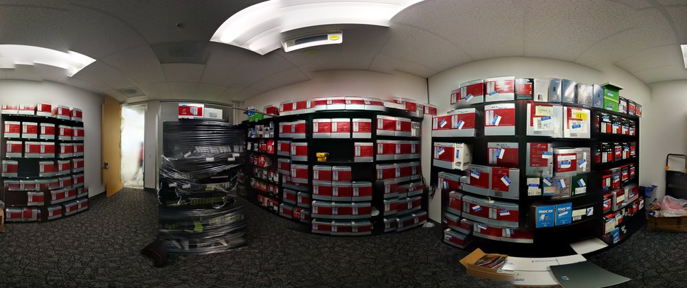
Rooms full of hard drives, each one jam-packed with aerial images.
How often do you update satellite images?
“We aim to update satellite imagery of the places that are changing the most,” Matt says. For instance, because big cities are always evolving, we try to update our satellite images every year. For medium-sized cities, we try to update images every two years, and it goes up to every three years for smaller cities. Overall our goal is to keep densely populated places refreshed on a regular basis and to keep up with a changing world, so we will refresh areas more frequently when we think there’s lots of building or road construction going on.
Why do we sometimes see mysterious objects on Maps? What are they?
Matt explains that sometimes the way the images are collected can create optical illusions. One of the most common instances of this are “sunken ships,” which are actually regular, operating ships that might appear underwater due to the way the satellite imagery gets layered together. Other times, sunlight can reflect off something shiny, and it will look like a strange white object that some believe are haunted houses or other such spookiness.
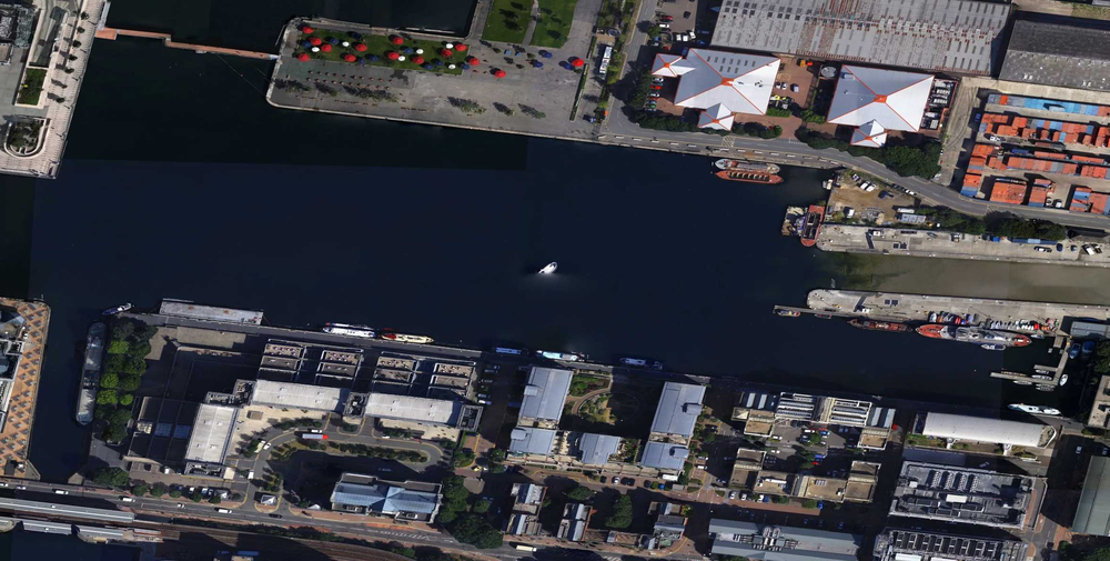
A spooky "sunken ship" illusion in London.
Because the satellite cameras take multiple pictures at the same time, but in different color spectrums, a fast-moving object, like a plane, can look strange, like several identical but differently-colored planes flying over each other.

As for Matt, his favorite part is finding public events that are happening when the images are captured. From hydroplane races to car shows, it’s fascinating to see events in the overhead imagery.
“When I was a kid growing up in Seattle, I always loved the hydroplane races that would happen each summer. It was a thrill to realize that we captured one from the air back in 2010,” Matt says. “The imagery isn’t visible in Google Maps anymore, but you can still see it using Google Earth Pro’s Historic Imagery feature, which lets you browse our full catalog of imagery.”

A hydroplane race on Lake Sammamish, Washington, on June 10, 2010.
How we’re supporting climate action in European cities
by Rowan Barnett on Oct.02, 2020, under 3D Models, Argentina, Australia, Brazil, California, Denmark, England, Germany, Google Earth, Google Earth News, Google Earth Tips, Google Sky, Google maps, Hawaii, Indonesia, Ireland, Italy, Japan, Kenya, Mexico, Natural Landmarks, Netherlands, Sightseeing, Street Views, USA
Climate action can have the biggest impact in cities, which are responsible for 70 percent of the world's CO₂ emissions. That’s why we committed to helping more than 500 cities reduce 1 gigaton of carbon emissions annually by 2030 as part of our ambitious plan for climate action. To help reach that goal, ICLEI-Local Governments for Sustainability, with grant support from Google.org, is funding six projects. The projects will use actionable data to test new strategies that can reduce emissions and improve air quality in cities across Europe.
ICLEI is a global network of more than 1,750 local and regional governments committed to sustainable urban development. Last fall, we granted $4 million in funding to them to establish the ICLEI Action Fund and support nonprofits and academic institutions in Europe and Latin America that are leading data-driven climate action efforts. Here’s a look at the projects that have been funded and what we’ve learned so far.
Projects selected for funding across Europe
The Centre for Sustainable Energy plans to establish an open-source, city-wide energy dataset in Birmingham, England. The team will also develop analysis tools that can model decarbonisation options for buildings in the city, overlay and integrate public datasets, and aggregate granular socioeconomic data.
With these tools, the Centre hopes to develop city-wide interventions and smaller community initiatives that will help the city reach its overall decarbonisation goals. “By combining emissions data for buildings, transport, and energy infrastructure with socioeconomic data, and distributing local community grants, we’ll be able to help residents deliver targeted carbon reduction projects, and support the City Council and Route to Zero Task Force to deliver their city-wide climate emergency ambitions,” said Rachel Coxcoon, Programme Director at the Centre for Sustainable Energy.
In Hamburg, the CityScienceLab of the HafenCity University will develop a tool incorporating data from Google’s Environmental Insights Explorer (EIE), Hamburg’s urban data platform and other sources. With this tool, they plan to help the city identify areas that can be used as “urban testbeds” for prototyping energy innovations in the Altona, Norg and Bergedorf districts. The prototyping process will help visualise and simulate projects to better understand their projected impact on the city.
Other Action Fund grantees and their projects include:
- Deutsche Umwelthilfe in Berlin: To help the city reach its air quality and carbon-free transport goals, they plan to analyze data about air quality, noise levels and traffic, and use EIE to advocate for data-driven changes to cycling and other transportation infrastructure.
- Carbon Co-Op in Greater Manchester: Working with local partners, they'll develop multi-sector energy plans for the regions and pilot three citizen-led projects focused on sustainable mobility and energy-efficient buildings. A newly developed urban energy dashboard will help them track impact.
- Miljopunkt Amager in Copenhagen: Using Google Air View, traffic data and community-collected data, they’ll test new urban space designs that may improve air quality.
- Air Pays de la Loire in Nantes: Using real-time air quality datasets that account for traffic conditions, they will provide citizens and local authorities with tools to make decisions about transportation management and traffic regulation systems.
The latest insights from cities taking data-driven climate action
Through these projects, we’ve seen how cities are thinking about data-backed sustainability planning and action. So far, we’ve seen trends that can be applied globally.
First, starting small can lead to a big impact—especially when it comes to data. City-level data can point decision-makers in the right direction, while neighborhood or district data can create the necessary community buy-in for more specific programs or interventions. Second, actionable data can help citizens make informed day-to-day decisions and take action. After all, informed citizens are a critical piece of the puzzle. Last, we saw a huge interest in cities looking to improve air quality through more efficient and low-carbon transportation options.
To have a meaningful impact on climate change, data-driven approaches must be scaled across the globe. That’s why Google.org provided ICLEI’s Global Secretariat with additional funding to develop case studies so they can share best practices that emerge from the Action Fund with cities around the world that are looking to implement similar data-driven climate interventions.
One of our goals at Google is to unlock climate ambitions with data, insights, and innovation to overcome today’s climate crisis. We’re excited to continue supporting leading organizations, such as ICLEI, and cities that share that goal.
Image Credit: Google Earth image of Paris, France 2019, Aerodata International Surveys, Maxar Technologies, The GeoInformation Group | InterAtlas
A new sense of direction with Live View
by Mirko Ranieri on Oct.02, 2020, under 3D Models, Argentina, Australia, Brazil, California, Denmark, England, Germany, Google Earth News, Google Earth Tips, Google Sky, Google maps, Hawaii, Indonesia, Ireland, Italy, Japan, Kenya, Mexico, Natural Landmarks, Netherlands, Sightseeing, Street Views, USA
Live View in Google Maps helps you keep your bearings so you can find your way around. With new ways to use Live View, we're making it even easier to orient yourself in the world whether you’re walking around, leaving a public transit station or meeting up with friends.
We launched Live View last year, and since then it’s helped people get around efficiently–especially during the pandemic, when getting from place to place as directly as possible is top of mind. Thanks to augmented reality (AR), you can see arrows, directions, and distance markers placed right on top of your world so you spend less time figuring out which way you should be headed.
Use landmarks to orient yourself in Live View
When you select or search for a place on Google Maps, you can already tap on the Live View button to visualize your destination in the real world. Soon, you’ll also be able to see nearby landmarks so you can quickly and easily orient yourself and understand your surroundings. Live View will show you how far away certain landmarks are from you and what direction you need to go to get there. These landmarks can include iconic places, like the Empire State Building in New York and the Pantheon in Rome, and easily recognizable places, like local parks and tourist attractions.
Seeing landmarks in Live View helps you better understand your surroundings.
Get Live View in more places
You can now access Live View right from the transit tab in Google Maps. Back in 2018, we launched multi-modal navigation–a way to get directions for a trip that involves a combination of transportation types, including walking, driving, biking and transit. Now, if you’re using transit directions and have a walking portion of your journey, you can use Live View to find your way. This is particularly useful when you exit a transit station and don’t know which way to go.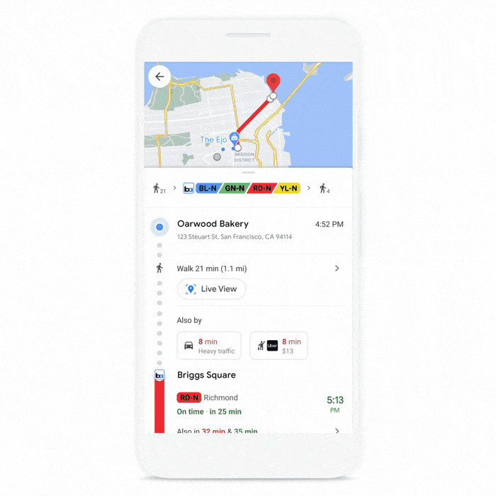
Use Live View right from transit navigation.
Live View in Location Sharing–
soon available on Android and iOS
If you’re meeting up with friends for a socially distant gathering, it can be hard to pinpoint exactly where they are. Last month, we launched Live View in Location Sharing for Pixel users, and we’ll soon expand this to all Android and iOS users around the globe. When a friend has chosen to share their location with you, you can easily tap on their icon and then on Live View to see where and how far away they are–with overlaid arrows and directions that help you know where to go.
Live View in Location Sharing will soon expand to all Android and iOS users globally on ARCore and ARKit supported phones.
A more accurate pin
To bring all of these features to life, we’ve made improvements to global localization, the underlying technology that powers all Live View features on Google Maps. With the help of machine learning and our understanding of the world’s topography, we’re able to take the elevation of a place into account so we can more accurately display the location of the destination pin in Live View. Below, you can see how Lombard Street—a steep, winding street in San Francisco—previously appeared far off into the distance. Now, you can quickly see that Lombard Street is much closer and the pin is aligned with where the street begins at the bottom of the hill.
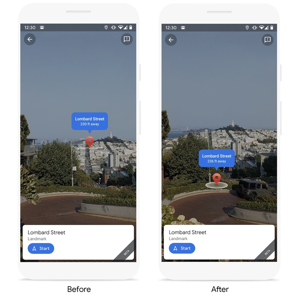
Improvements to global localization now show a more accurate pin placement.
No matter where you’re walking, Live View can help you get there as efficiently as possible. You’ll start seeing Live View in the transit tab and Location Sharing on Android and iOS in the coming weeks, along with a more accurate pin. Landmarks start rolling out soon on Android and iOS in nearly 25 cities* around the world, with more to come.
*Amsterdam, Bangkok, Barcelona, Berlin, Budapest, Dubai, Florence, Istanbul, Kuala Lumpur, Kyoto, London, Los Angeles, Madrid, Milan, Munich, New York, Osaka, Paris, Prague, Rome, San Francisco, Sydney, Tokyo, Vienna
Looking for something?
Use the form below to search the site:
Still not finding what you're looking for? Drop a comment on a post or contact us so we can take care of it!
Visit our friends!
A few highly recommended friends...
Archives
All entries, chronologically...